
Trading Equity Curve Simulation at a Glance: Key Facts
| Question | Answer |
|---|---|
| What is a trading equity curve? | A visual record of how account value changes over a series of trades |
| What does an equity curve simulator do? | It generates multiple simulated outcome paths using your win rate, risk-reward ratio, and position size |
| What method do most simulators use? | Monte Carlo simulation, which randomly reorders trade outcomes across thousands of runs |
| What are the key inputs? | Win rate, reward-to-risk ratio, risk per trade, and number of trades |
| What does the output show? | Best, worst, and most probable equity paths, plus maximum drawdown and risk of ruin |
| Who benefits most from simulation? | Traders preparing for a funded challenge, stress-testing a new strategy, or reviewing a losing streak |
What Is a Trading Equity Curve and Why It Matters
A trading equity curve is more than a performance chart. It is a data-driven picture of how your account grows or falls across a sequence of trades. Traders who only check their net profit miss what the curve reveals: whether gains came smoothly or through a series of dangerous swings.
Two traders can finish a month with the same net profit. One got there through a steady, consistent path. The other survived a 25% drawdown midway through. The equity curve separates these two realities instantly.
The Difference Between a Backtest and a Simulation
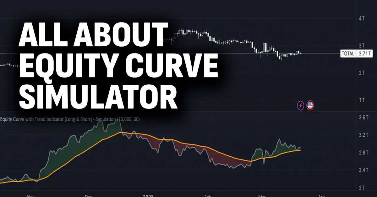
A backtest replays your strategy against historical price data in one fixed sequence. That sequence is one of millions of possible orderings. Trading equity curve simulation takes the same trade results and reshuffles them thousands of times, showing how your strategy performs across all plausible orderings, not just the one that happened.
This distinction matters because a backtest can flatter a strategy. A simulation exposes its true variance.
What a Healthy Equity Curve Looks Like
A healthy curve trends upward steadily, with drawdowns that recover quickly and do not exceed the trader's defined risk limit. The slope does not need to be steep. Consistency across hundreds of simulated paths is the real signal.
Curves that spike and crash, or that produce large profits in only a minority of simulation runs, signal a fragile strategy. That fragility is invisible in a single backtest.
Key Takeaway: An equity curve shows the shape of a strategy's performance, not just the result. A simulation reveals how stable that shape is across thousands of possible trade sequences. Both pieces of information are needed before putting real capital at risk.
How an Equity Curve Simulator Works
An equity curve simulator takes a small set of inputs and uses statistical modelling to project thousands of different outcomes. The tool does not predict the future. It maps the probability landscape of your strategy so you can plan for what is likely and prepare for what is possible.
The underlying logic is the same across most simulators: generate random sequences of wins and losses, calculate the resulting account balance at each step, and repeat the process enough times to build a statistically meaningful picture.
The Inputs Every Simulation Needs
Four numbers drive every simulation:
- Win rate (the percentage of trades that close in profit)
- Reward-to-risk ratio (average profit per win divided by average loss per loss)
- Risk per trade (the percentage of account capital risked on each position)
- Number of trades (the length of the simulated period)
Each input has a direct relationship with the output. A higher win rate produces more winning paths. A higher risk per trade amplifies both gains and drawdowns. Changing one value changes the entire distribution of outcomes, which is why simulation is a far more powerful planning tool than a static calculation.
How Monte Carlo Randomises Trade Order
Monte Carlo simulation works by generating a random number for each trade in the sequence. That number is compared to the win rate to decide whether the trade wins or loses. The process repeats for thousands of separate runs.
Because the order of wins and losses varies in each run, the resulting equity curves spread across a wide range of paths. Some paths hit peak drawdown early and recover. Others stay flat for long stretches before trending up. A small number blow up entirely. All of these reflect statistically plausible futures for the same strategy.
The 2026 industry standard is a minimum of 1,000 simulation runs for reliable statistics, with 5,000 or more runs preferred for high-confidence drawdown percentiles.