
Forex Economic Calendar at a Glance: 5 Key Facts
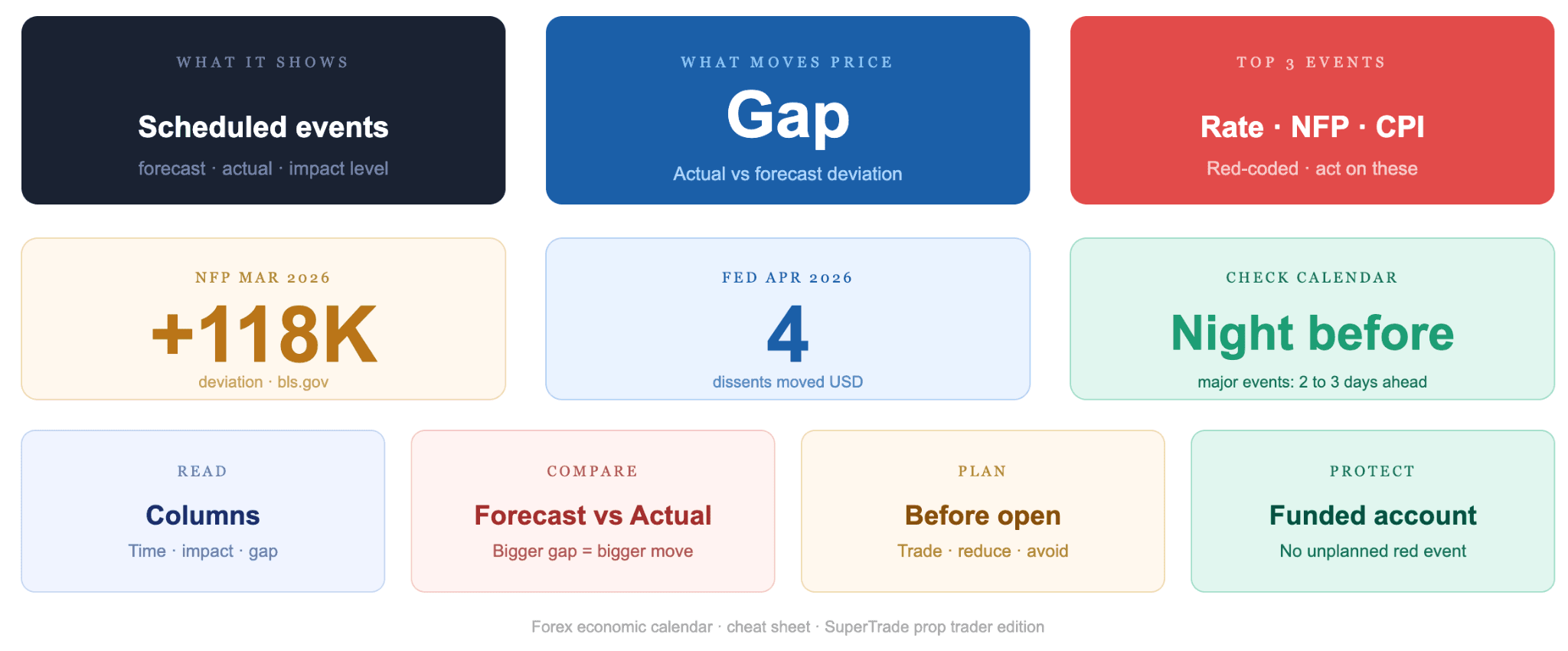
- Shows scheduled global economic data releases
- Color-coded by expected market impact level
- Displays forecast, actual, and previous values
- Covers central bank decisions and key reports
- Used daily for trade planning and risk management
How to Read a Forex Economic Calendar: The Core Columns
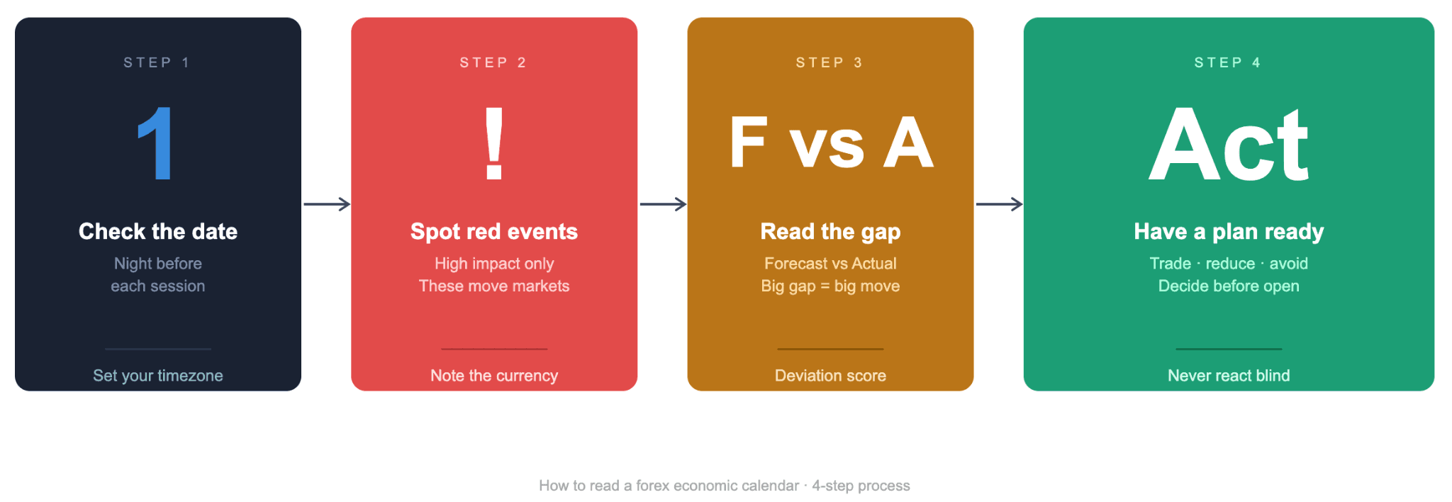
Reading the schedule starts with understanding what each column tells you. Most platforms show the same core fields, arranged so you can scan and act on what matters. Once you know each field, the tool becomes a practical planning asset rather than a wall of numbers.
Date, Time, Currency, and Impact Level
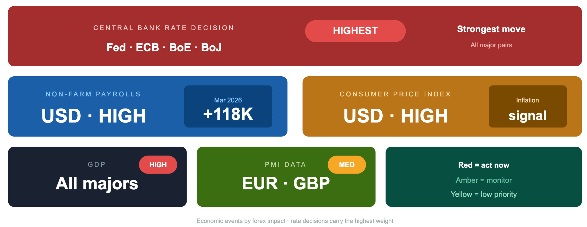
The date and time columns show exactly when each event drops. Most calendars let you set your local time zone so you never miscalculate a release window. The currency column indicates which currency the event is most likely to affect. A US Non-Farm Payrolls release tags USD. A Bank of England rate decision is tagged to GBP.
The impact level column uses a color system to signal expected volatility:
- Red: high impact, expect strong moves
- Orange: medium impact, moderate reaction
- Yellow: low impact, minimal market effect
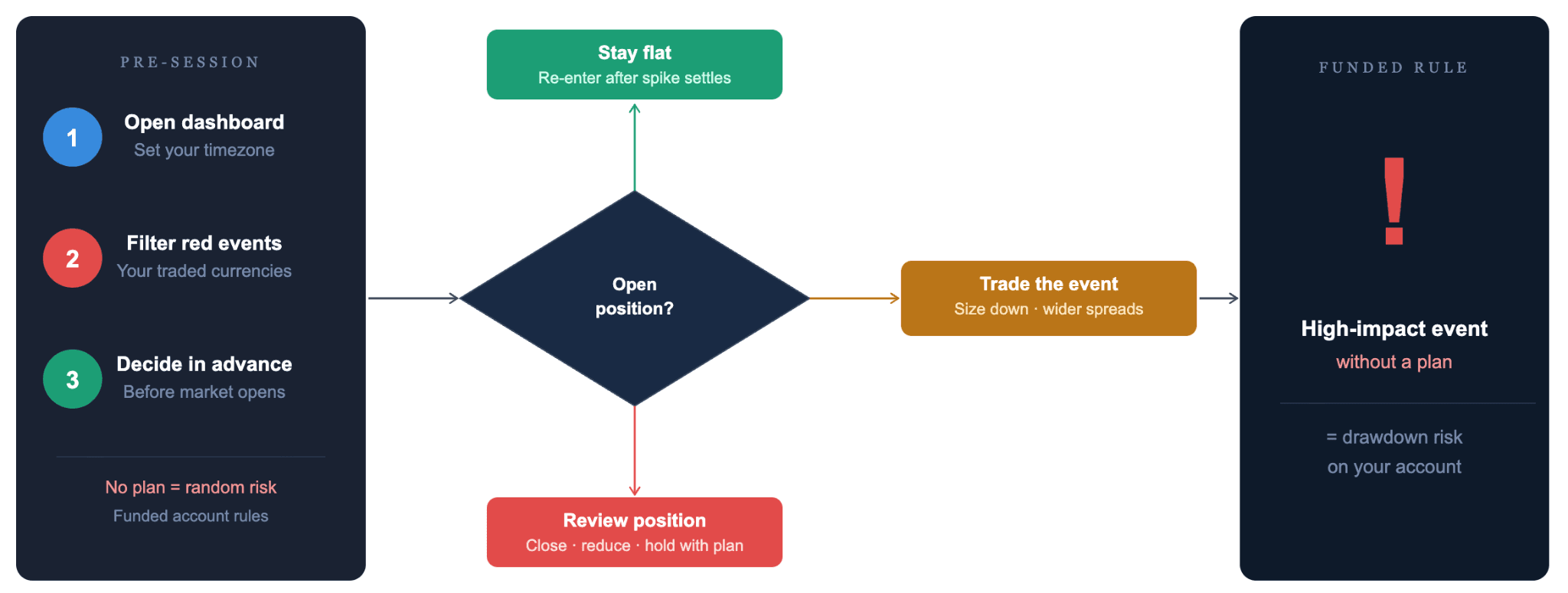
Red events demand your full attention. Medium and low-impact releases can be monitored without adjusting your positions.
Forecast, Actual, and Previous Values
These three columns hold the real information. The forecast is the consensus estimate from polled economists before the release. The actual figure appears the moment data is published. The previous reading shows the result from the last time this indicator was reported.
Traders read all three columns together. A result matching the forecast rarely moves the market. A result that beats or misses the forecast is what creates economic data releases worth acting on.
How to Read the Deviation Score
This number sits between the forecast and actual columns, and most traders walk straight past it. Professional traders treat it as the clearest signal on the schedule. The deviation score is the numerical difference between what economists predicted and what the data actually showed.
A large positive deviation means the actual result beat expectations. A large negative means it disappointed. The bigger the deviation, the stronger the likely market reaction. Some calendars display this score directly. On simpler ones, subtract the forecast from the actual yourself.
"The deviation score is the number most traders scroll past. It tells you not just what happened but how far reality fell short of expectation. That gap is what actually moves price."
Key takeaway: The core columns give you time, currency, impact, and the forecast-versus-actual gap. The deviation score is the sharpest signal on the schedule, and the one most traders miss.
How Economic Calendars Work: Forecast vs Actual
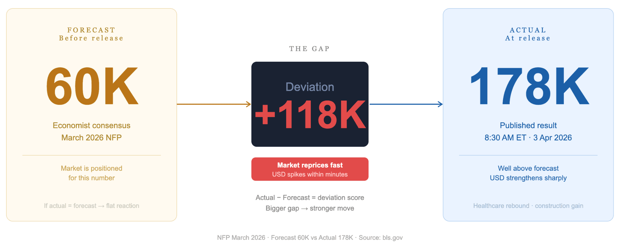
Markets do not move on news alone. They move on the difference between what was expected and what happened. This is the core logic of how economic calendars work. The forecast column matters as much as the result itself.
Why the Gap Between Forecast and Actual Drives Volatility
When a central bank raises rates by exactly the amount markets predicted, the price reaction is often flat. The market already priced in that outcome. When the actual result deviates from the forecast, the market reprices fast. That repricing is where volatility comes from.
The March 2026 US Non-Farm Payrolls release illustrates this directly. The economy added 178,000 jobs against a consensus forecast of 60,000. That deviation of 118,000 cleared both sides of the market within minutes. Traders who noted the forecast-to-previous gap ahead of the release, and positioned accordingly, captured that move. Those who reacted after the fact chased a market that had already moved.